


PROJECT GALLERY
BEATRICE TYPE DISPLAY
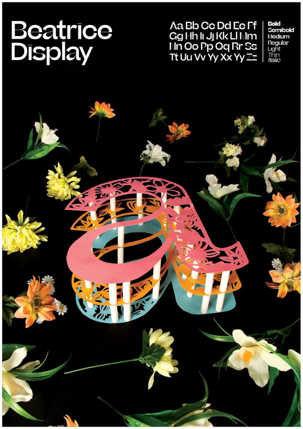
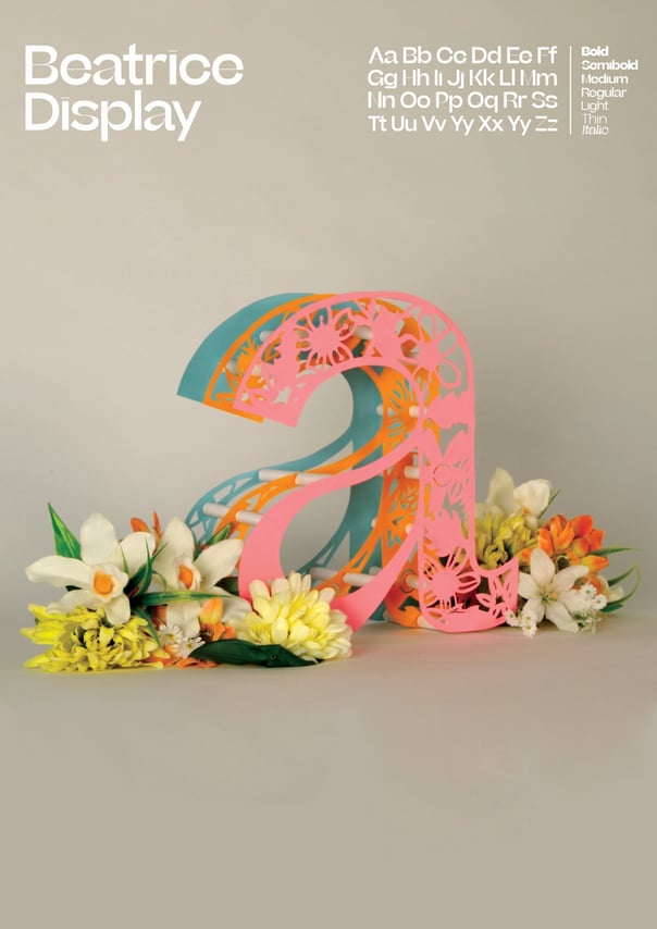
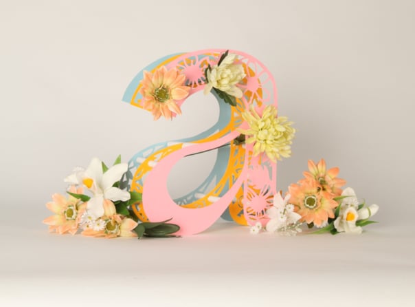
This brief was all about creating a professional looking type specimen poster. Our chosen typeface was "Beatrice". The specimen display was to have one letter from the selected type foundry to be recreated in a three-dimensional form with a background environment that corresponds with the style. The letter 'a' was chosen as it demonstrates delicate thick and thin lines (different weights) from the typeface perfectly.
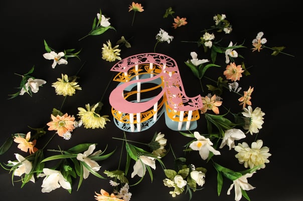
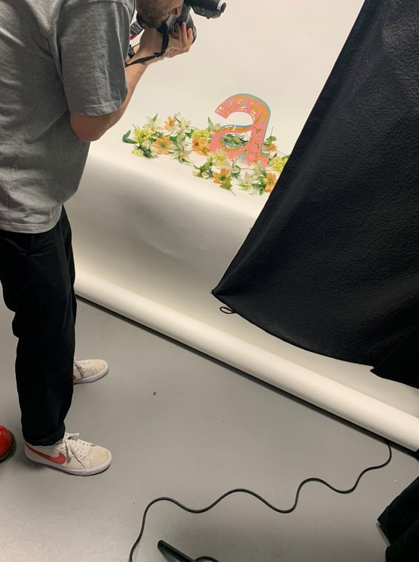
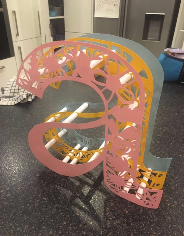
The letter was formed by using coloured card and was precisely cut by scalpel to present fine floral details. The letter had wooden beams to hold it up in place so that it was 3D. Once designed, the letter was then professionally photographed with flowery props that created depth and atmosphere. These photos were edited on Adobe Photoshop to complete the display, creating a beautiful poster as to what represents "Beatrice" best.
FOLLOW ME, CONTACT ME, HIRE ME :
THANK YOU!
